;Resize=(1108,194))


Ingrediënt

The hero banner is a full-width image, which is pulled from the asset bank (TAB). This component can be used to present full-width images anywhere on the page, but is usually positioned at the top below the main header navigation.The hero banner has an optional title, subtitle and Call To Action (CTA) button. There are different banner styles which can be chosen.
Tutorials are two opposite elements that can display information such as a timeline or how to apply a product.
Products can be chosen to your liking in this carousel. Title can't be changed. There is a four product max.
The article asset component enables the brand to show a collage of different pictures with titles. (Only below or next to each other). The amount of images you want to use is unlimited.
The article listing component enables the brand to show articles that are interesting to the displayed article. Or either to display other interesting information. The image and text displayed are directly from the article and can't be changed in the component. What can be changes is the headline. Finally there is a button that links you to all articles. Four articles is the max but the component looks best with three articles.
Get Ready Fast For Fall Style Tips
Featured content components can be configured in multiple ways.
This component dispalys Centered big title with subtitle below.
Heat treatment is getting more popular everyday. Most of us have our own conceptions about this treatment.
This component dispalys Contact us information with different variations.
We’ll help you find what you’re looking for.
1-800-555-8888
Monday-Friday
8:30 AM-6:00 PM Eastern Time
1-800-555-8888
This number is available 24 hours
a day/ 7 days a week.
1-800-555-8888
Monday-Friday
8:30 AM-6:00 PM Eastern Time
1-800-555-8888
This number is available 24 hours
a day/ 7 days a week.
Within this part elements will be displayed which can be used throughout the website such as simple images and texts
Lorem ipsum dolor sit amet, consectetur adipiscing elit. Proin at metus purus. Proin eu nunc vitae orci efficitur laoreet. Maecenas at nibh tortor. Vivamus cursus purus arcu, et tristique eros ornare quis. Suspendisse eget viverra odio, vel euismod justo. Vestibulum a elit sapien. Curabitur varius nunc in mi bibendum bibendum.
Ingrediënt
Wat het precies doet
Amyloglucosidase
Een natuurlijk enzym dat de goede bacteriën in je mond stimuleert.
Glucose-oxidase
Een natuurlijk enzym dat de goede bacteriën in je mond stimuleert.
Lactoperoxidase
Een enzym dat in je speeksel voorkomt en dat we uit koemelk halen. Het werkt samen met kaliumthiocyanaat om de goede bacteriën in je mond te stimuleren.
Colostrum
Colostrum van de koe bevat een proteïne die het natuurlijke immuunsysteem van je mond ondersteunt.
Lactoferrine
Een proteïne, aanwezig in koemelk, die voorkomt dat slechte bacteriën in je mond gedijen door hun ijzervoorraad weg te nemen.
Lysozyme
Een proteïne in het eiwit van een kippenei, die de slechte bacteriën in je mond in je mond verzwakt door hun weerstand af te breken.
Kaliumthiocyanaat
Kaliumthiocyanaat is van nature aanwezig in speeksel en werkt samen met lactoperoxidase om goede bacteriën in je mond te stimuleren en slechte te verminderen.
Natriumfluoride
Helpt het glazuur te versterken, dat je tanden beschermt tegen gaatjes. We gebruiken 1450 ppm natriumfluoride in onze tandpasta's voor volwassenen, en 500 ppm in onze formule voor kinderen. Deze hoeveelheden worden aanbevolen door tandartsen.
Zinkgluconaat
Afgeleid uit natuurlijke ingrediënten en helpt de proteïnen en enzymen in je mond je orale microbioom te stimuleren.
Ingrediënt
Wat het precies doet
Carrageenan
Dit ingrediënt komt voor in zeewier en geeft je tandpasta mede structuur. Zo blijft die bijeen in de tube, maar kun je hem nog steeds uitpersen.
Citroenzuur
Natuurlijk verkregen uit zetmeel of suikers. Dit ingrediënt werkt samen met natriumwaterstoffosfaat om de pH-waarde van de tandpasta in evenwicht te brengen, zodat de perfecte omgeving wordt gecreëerd voor de actieve ingrediënten om hun werk te doen.
Natriumwaterstoffosfaat
Werkt samen met citroenzuur om de pH-waarde van de tandpasta in evenwicht te brengen, zodat de perfecte omgeving wordt gecreëerd voor de actieve ingrediënten om hun werk te doen.
Glycerine
Glycerine wordt verkregen uit plantaardige oliën en houdt water vast in de tandpasta om de ingrediënten te binden.
Gehydrateerd silicium
Een natuurlijke exfoliant verkregen uit zand, die resten, plak en vlekken verwijdert. Dit type silica gebruiken we om Zendium tandglazuurvriendelijk te maken.
Natriumbenzoaat
Een conserveringsmiddel dat je tandpasta veilig houdt door de groei van mico-organismen te voorkomen.
Sorbitol
Dit ingrediënt komt uit granen als mais en tarwe. Het houdt water vast in de tandpasta en helpt de ingrediënten te binden.
Steareth-30
Een schuimmiddel. Het is zachter voor het tandvlees en de binnenkant van de wangen dan natriumlaurylethersulfaat (SLS), het schuimmiddel dat voorkomt in standaard tandpasta's.
Water
Biedt een natuurlijke basis voor de zorgvuldig geselecteerde ingrediënten van Zendium.
Xanthaangom
Een natuurlijk ingrediënt dat je tandpasta mede structuur geeft. Zo blijft die bijeen in de tube, maar kun je hem nog steeds uitpersen.
Ingrediënt
Wat het precies doet
Aroma
Een mildere smaak dan die de meeste tandpasta's gebruiken, daarom is het ook geschikt voor de meest gevoelige monden.
Sacharine
Een zoetstof om de milde smaak van onze tandpasta's te verbeteren.
Cl77891
Een ingrediënt verkregen uit natuurlijke mineralen, dat helpt om je tandpasta wit te houden.
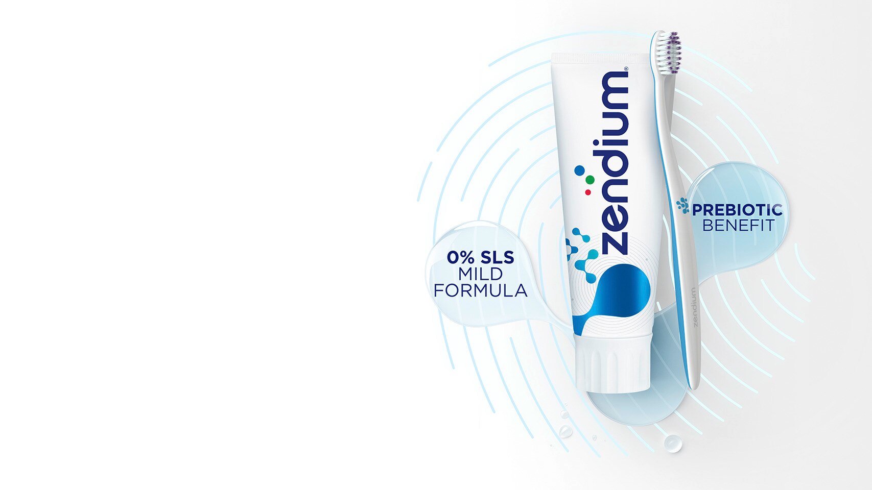
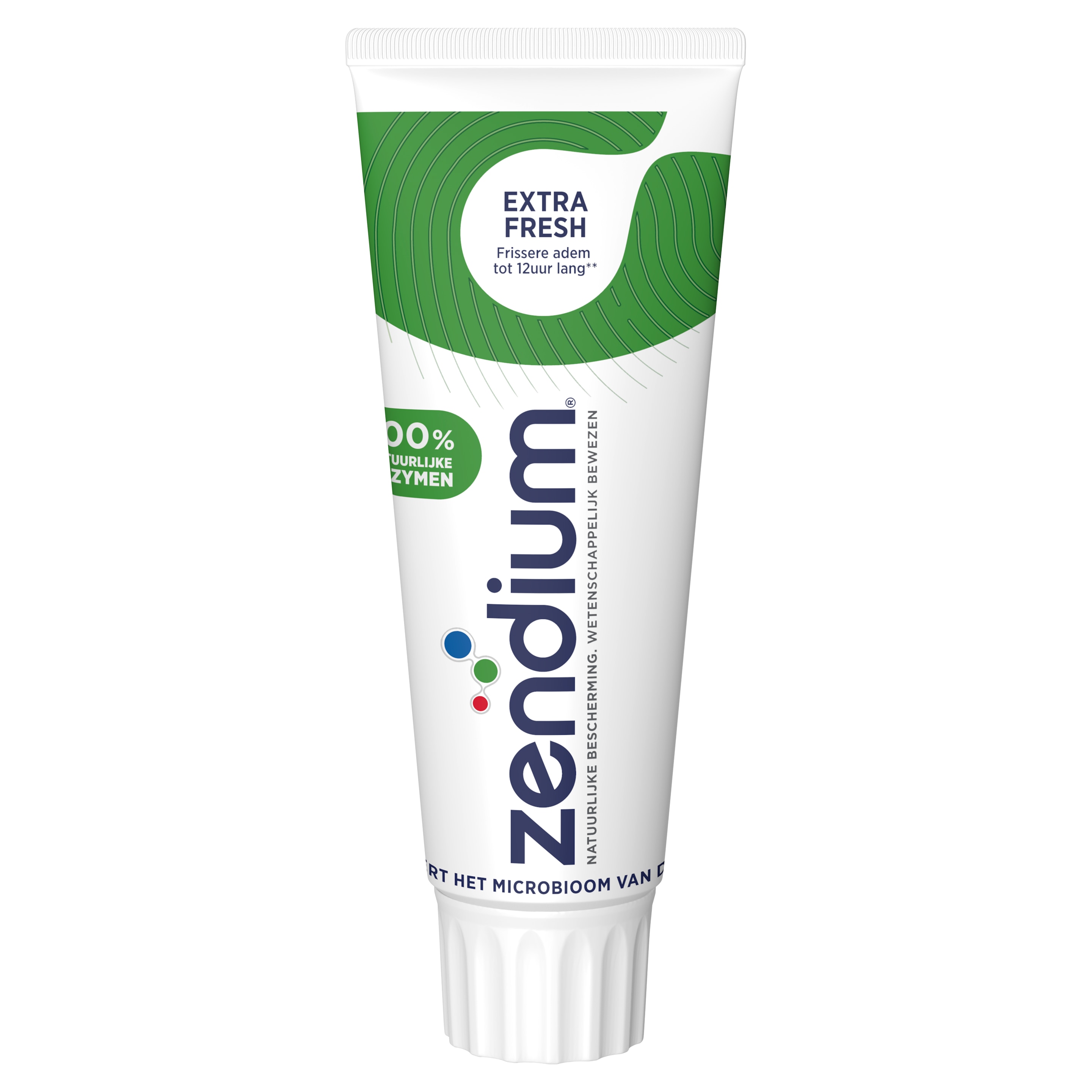
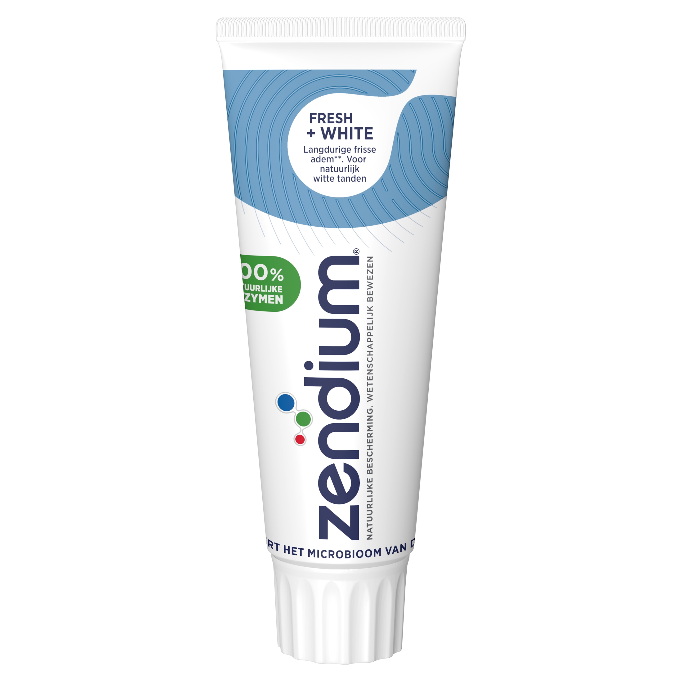
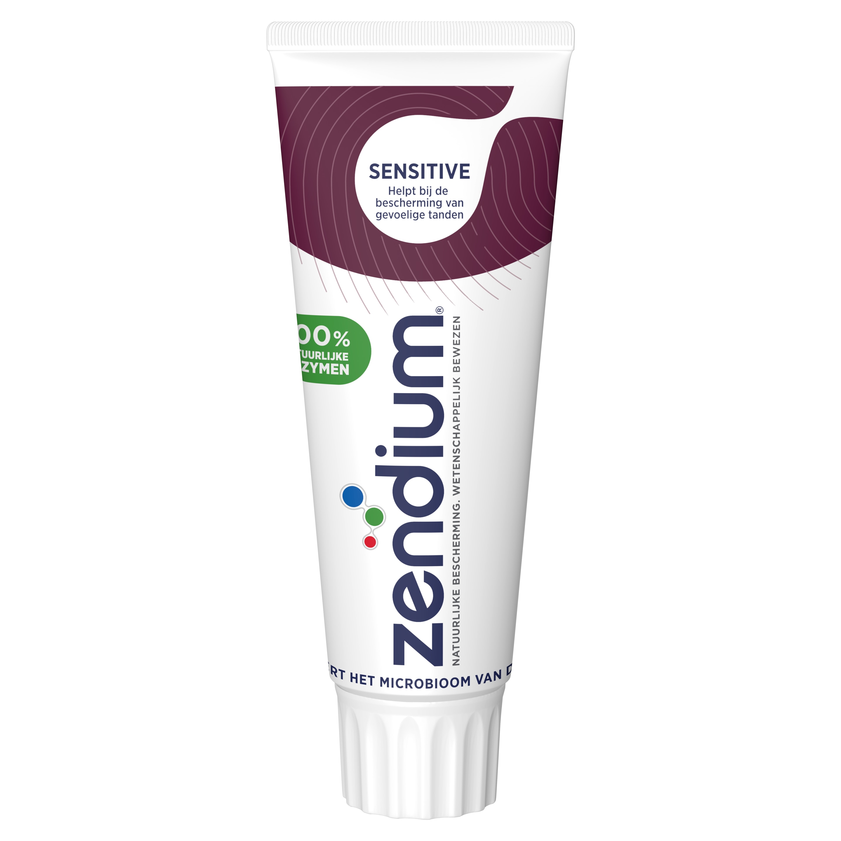
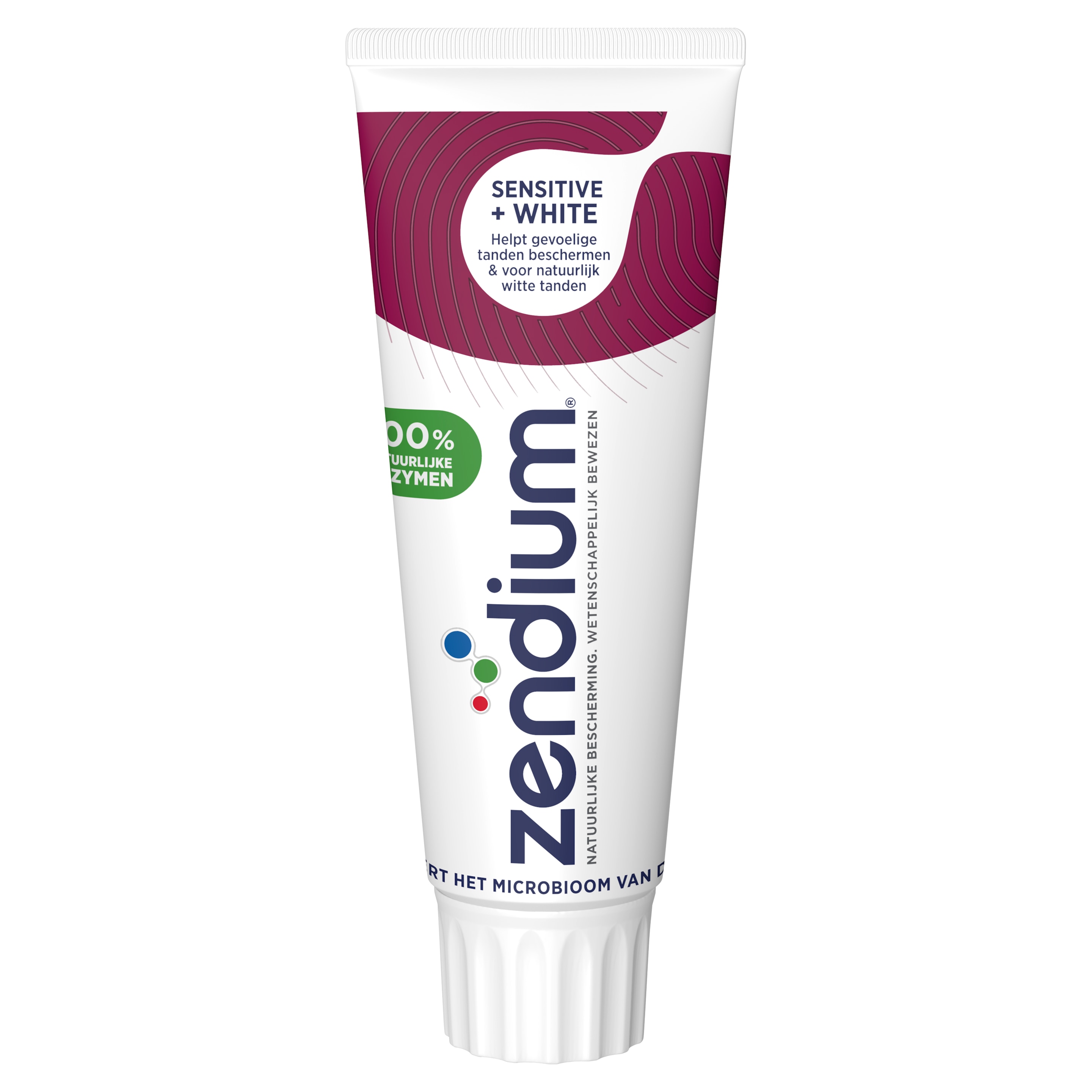
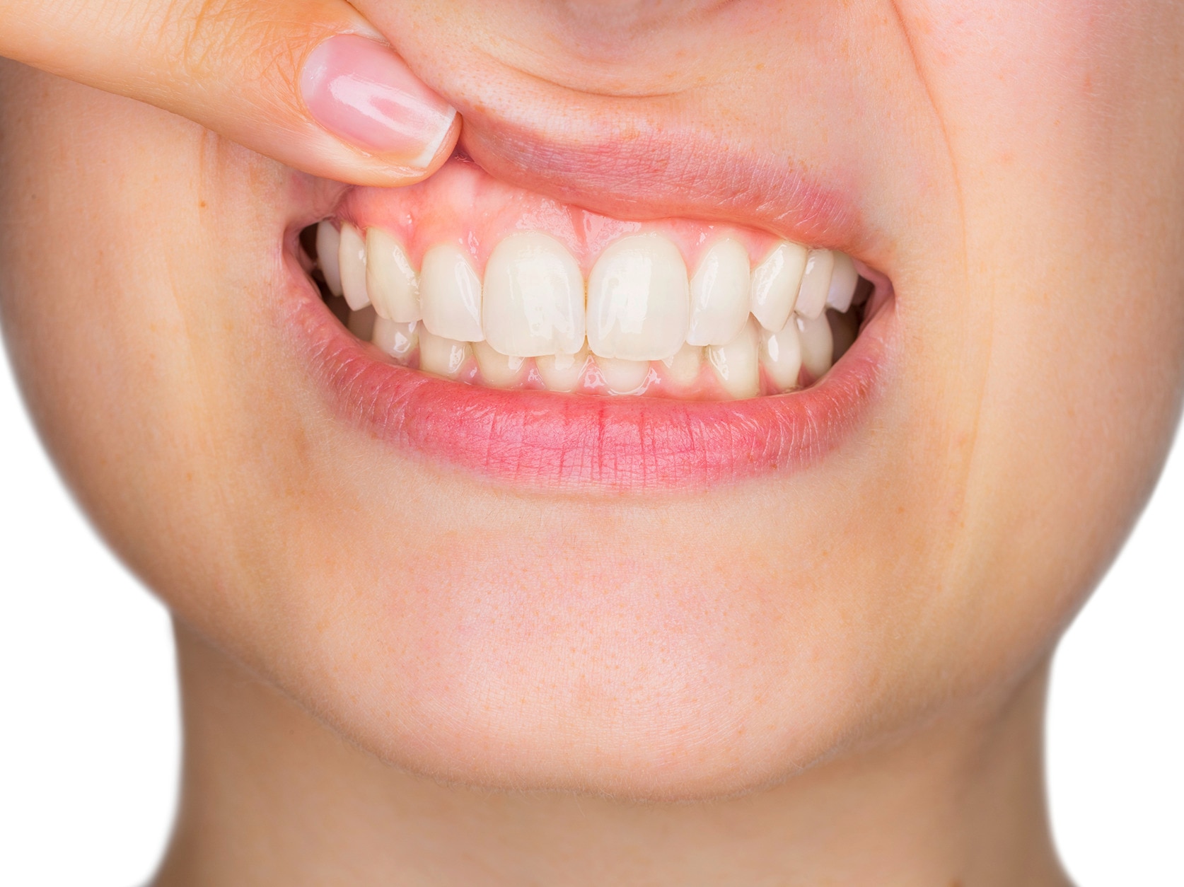
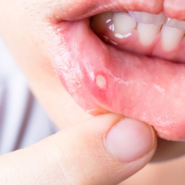
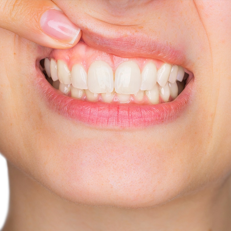
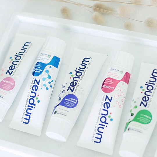
Zendium-producten bieden een wetenschappelijk bewezen, natuurlijke mondbescherming voor gezond tandvlees, sterke tanden en een frissere adem.
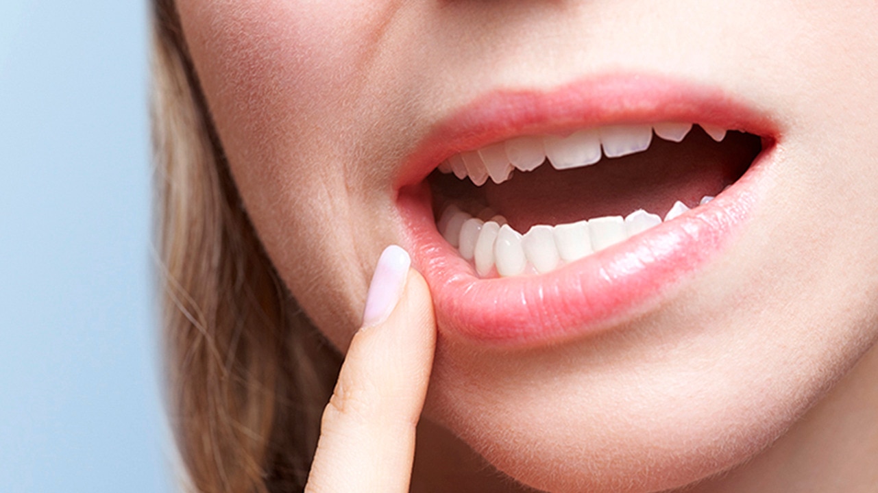
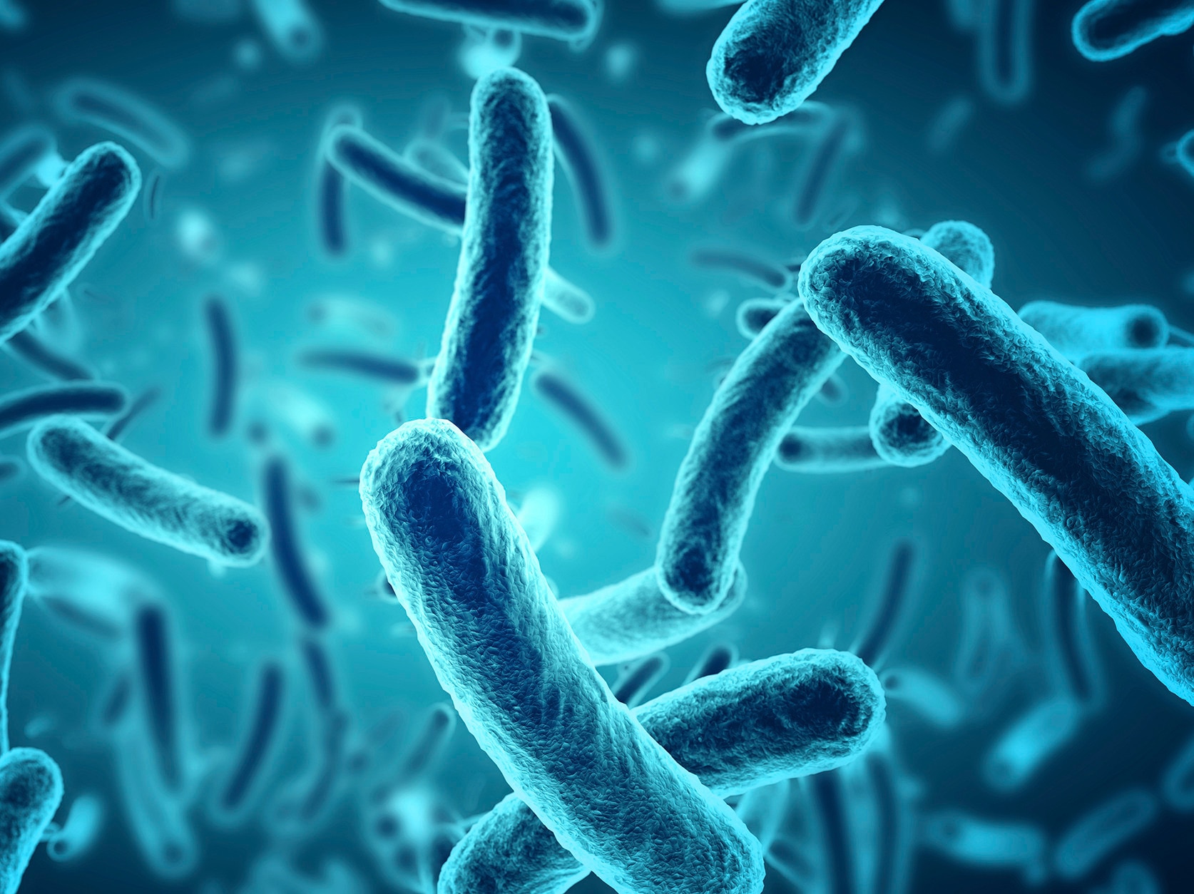
Biofilm, en andere oppervlakten van de mond, kunnen beïnvloed worden door wat er gebeurt met de mond.